Mobility Backoffice
Information architecture and interface design for a backoffice tool
Europcar Mobility Group, 2016-2019
While at Ubeeqo, Europcar Mobility Group was aiming to unify all operations into as many few tools as possible. A dedicated squad was in charge of building a management tool for existing and future business units.
I was responsible for the information architecture, UX/UI definition, design implementation and validation.
I was responsible for the information architecture, UX/UI definition, design implementation and validation.
Responsabilities:
Information Architecture
Leading the UX and UI design
Due to NDA agreements information displayed has been modified

Project Definition
One tool to rule them all
Most of the companies, held by the Europcar Mobility Group, where within the mobility spectrum and shared a pretty similar structure, developing a versatile and consistent platform to rule them all made perfect sense.
We set off to scope and understand their common general sections, content, users types and roles. We mapped user actions, worked on the information architecture and refined resources information and settings.
We set off to scope and understand their common general sections, content, users types and roles. We mapped user actions, worked on the information architecture and refined resources information and settings.


Information Architecture
Structure and Interaction Consistency
Throughout the Backoffice, tasks and actions varied greatly. Users had to set up configurations, navigate across varied entities, analyse data and assign or perform actions.
It was impossible to foresee all the existing and future features any given business unit might need. What we did find was that
information and content structure was quite consistent and easily organised.
We focused on keeping the experience coherent and intuitive no matter the task at hand, while not disregarding tidiness and ease in navigation.
We standardised the content structure and created navigation, layout and interaction patterns that unified most of the platforms content.

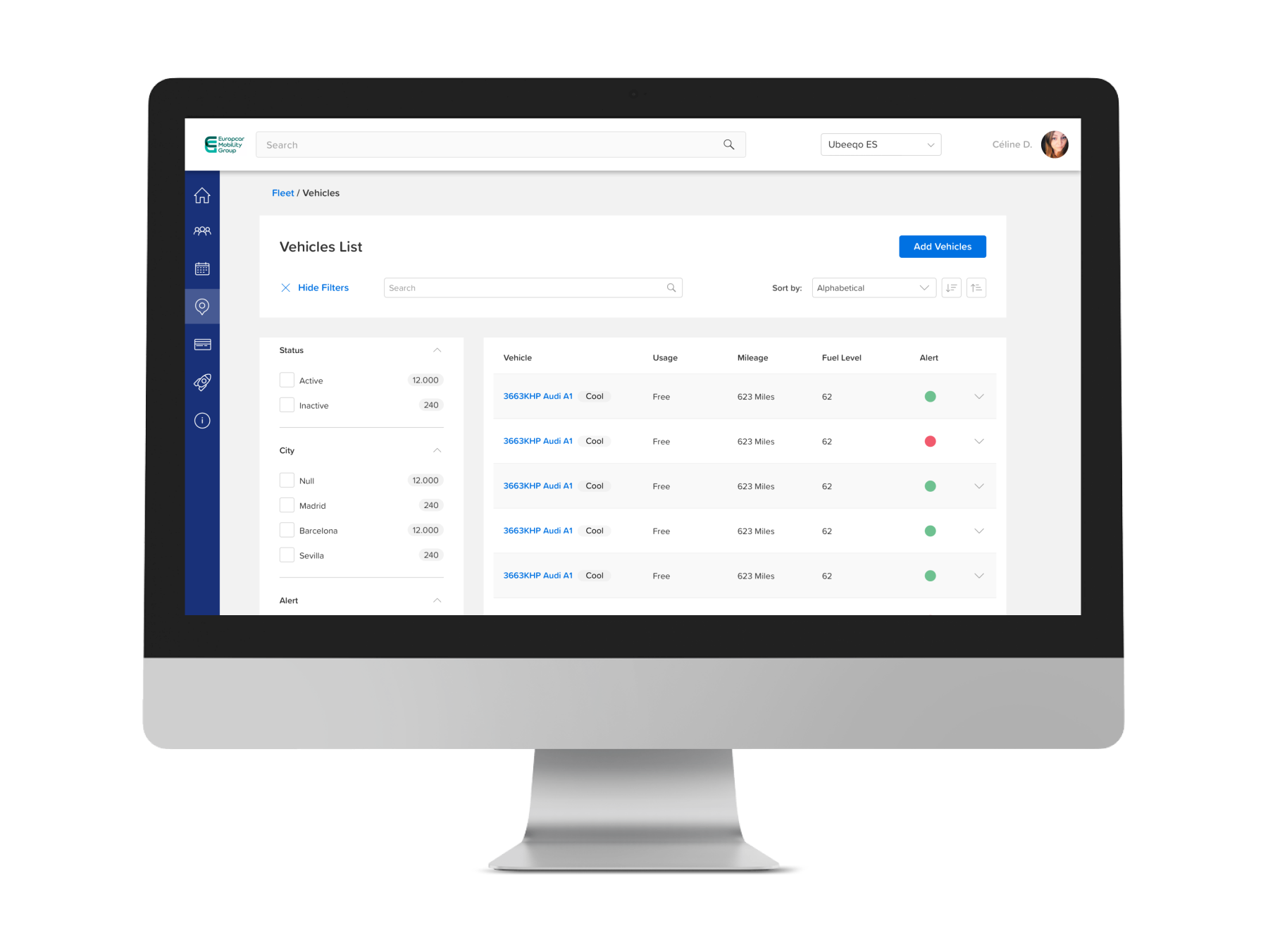
Content was accessed through a Main Resources Menu or a search bar. Items in resources where listed in a filtrable list displaying relevant information such as status

Detail pages for each item had an identical structure. Having an a transversal overview area and tabs holding related content cards. Actions where displayed in a consistent location and edition happened in a contextual modal view.

A feature walkthrough
Setting up Cost Allocations for companies using carsharing B2B service
This feature, part of the B2B companies management, aimed to unify the settings regarding third party mobility cost allocations, while keeping it flexible to meet different scenarios.
We defined a universal path, further disclosing settings, based on the needs of each case.
We defined a universal path, further disclosing settings, based on the needs of each case.

Cost Allocation (CA) logic map

Default and active Cost Allocation Card

Cost Allocation creation modal
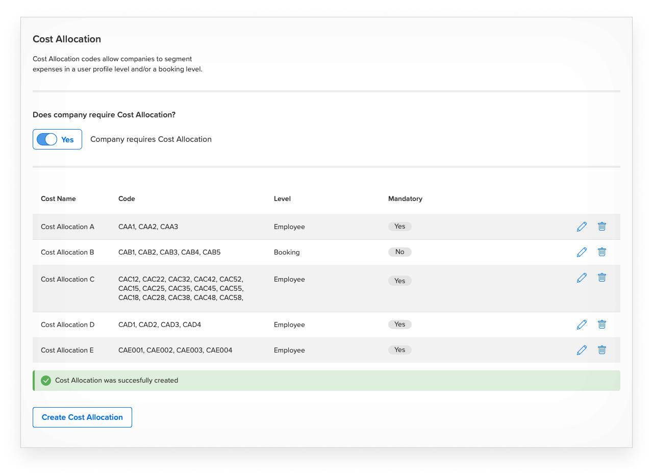
Filled Cost Allocation Card

Cost Allocation edition modal
UI Design
Anatomy of a table component
To create a consistent design and experience throughout the Mobility Backoffice we developed extensive tokens, UI patterns and components, that eventually transformed into a design system.
Here is an example of design definition of the table component.
Here is an example of design definition of the table component.

Interface Atomic items

List rows and filters molecules

A design oriented for user performance


Thanks to all the great people I was lucky to collaborate with in this project, specially to Sara, Pablo, Sidonie, Stavan, Gabo, Steffie, Jaume, Shahin, Mehdi, Ivan and Adam.
Mobility Backoffice. Europcar Mobility Group, 2016-2019